Ren & Stimpy & Charactered Pieces
December 29, 2009This is a guest post from Caleb J Ross, author of the chapbook Charactered Pieces: stories, as part of his ridiculously named Blog Orgy Tour. Though his book is in no way related to cartoons, I demanded he discuss the topic to make his pimping at least somewhat site relevant. Being a nice man with a pleasantly shaped head, he agreed.
Visit his website for a full list of blog stops. Charactered Pieces: stories is currently available from OW Press (or Amazon.com). Visit him at http://www.calebjross.com.
My childhood was essentially wallpapered in cartoons and video games. Rarely, I believe, does this come through in my writing. But, search outside the words, and the remnants of Saturday mornings spent worshiping the television do mysteriously appear like Gazoo to usher a Flintstones plot twist. The up-close, intricately detailed “gross shorts” from Ren & Stimpy, for example, definitely fueled my appreciation for the use of magnification to enhance interest. Also fueled by Ren & Stimpy: my yearning for, what I later learned are nonexistent, powdered breakfast foods.
Ren & Stimpy, generally a cartoon with traditional 2-D art and color palettes, would emphasize certain scenes with intricately rendered close-ups, often for gross-out purposes. A simply drawn fish head (a scene from an episode in which Stimpy’s fart marries a fish skeleton…seriously) would magnify to show the texture of the scales, the visual fumes wafting from the carcass, and would stress shadow contrast making for an even more disgusting image. These stills became one of the main draws to Ren & Stimpy, despite its brilliantly irreverent storylines and culturally aware character styles (Family Guy simply would not exist were it not for Ren & Stimpy).
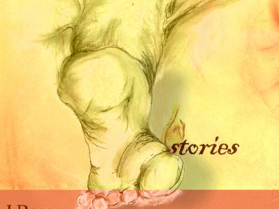
The cover of my chapbook, Charactered Pieces, adopts this gross-out magnification, though perhaps not to a level noticeably similar by casual observers of both the book and the cartoon. Quite consciously, though, I referenced my memories of the demented cartoon in order to create an image that does three things, in a specific order: 1) intrigues, 2) confuses, 3) disturbs. The last item doesn’t happen until one reads the title story.
I’ve posted a few more words about the cover over at ArtJerk.net.


*SPOILERS* sort of
The cover did it’s job magnificently. I knew that the main object in the drawing was a foot, but it was only after I finished the story and closed the book that I noticed the hint of breasts at the top of the cover, then the belly button, and then it all made sense. Probably one of the better cover-to-story tie ins I’ve ever seen!
Thanks, Mike! For a cover design hobbist such as myself, your compliment goes a long way. Really, thank you.
[…] I stop at Nicholas Karpuk’s blog, which consists of a series of posts tagged “Cartoon Hell,” that comment on a cartoon […]
[…] Nicholas Merlin Karpuk […]
breakfast foods should always be high in protein and also in carbohydrates, we need food energy during the early morning -“,